Spline Script
It's been a while since the last time I was down the rabbit hole of generative handwriting. However, I thought I'd describe the experiments I've been doing over the past week or so in some more detail.
Let me start by pointing out that many have been exploring this before me, whether generative or not. My personal favorite is Letters from my Mother by Vera Molnár. Another interesting project is this work on neural networks for handwriting.
My current script consists of an alphabet that is generated before each execution. Each character, or glyph, is generated in the same way, but they can have different properties.
First you will need to define a function that can generate points
distributed within a suitable domain. Let's call this function
domainfxn. domainfxn defines the area within
which the glyph is generated. An easy choice is a square. A more natural
choice, if you want it to look like hand writing, is a tilted ellipsoid.
The latter is what I will use here.
One way to create such an ellipsoid is to create a function that can generate points that are uniformly distributed in a unit circle. Then squeeze those points together by multiplying the x coordinate by by a small number (e.g. 0.5) Finally you can tilt the results by rotating the points by a suitable angle.
We now have a function that defines the domain. Next we use that function
to generate n centroids. In my example I use n=5. These
centroids split the domain into n sections. If you are
familiar with Voronoi
tessellations, you will already know what this means. If not, have a
look at the illustration above.
These n centroids combined with domainfxn is now
used to define a glyph. Each time we want to draw the glyph we now do the
following: For each centroid, generate a new point within the area of the
domain that corresponds to that particular centroid. And finally, use these
new points to draw a spline. An
example of this can seen below.
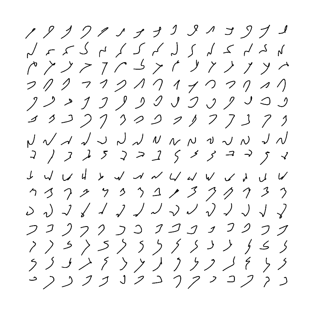
This approach has the advantage of giving the glyph some variation between each time it is drawn. Arguably it also has the disadvantage of giving too much variation. To illustrate this we show multiple instances of the same glyph in the illustration below. Each line corresponds to a single glyph. There are some ways to make this a little more "tight", but I also like how this looks.
If you look carefully at the above illustration you will also notice that every glyph has a "looping" tendency. This is achieved by ordering the centroids according to their angle relative to the middle of the glyph (the origin of the domain). This is just one of many possible tweaks you can add to control the overall appearance of the resulting script. Another adjustment is to change the size of the domain of some of the glyphs.
We now have the means to generate a working alphabet. To use the alphabet to write words we simply concatenate the spline of a single glyph with the neighbouring characters in the word.
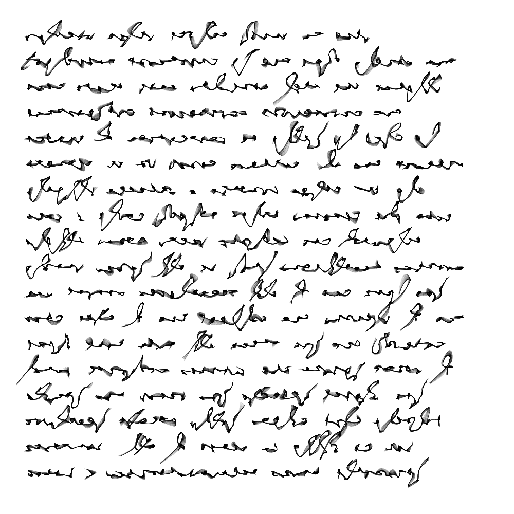
Below is an example of how it looks when you put it all together. This image writes out a section from the first chapter of Oryx and Crake by Margaret Atwood. The cursive effect is created by using the sand painting method described in this earlier post, along with random walks as described here.
There are many more things to test with this system, but this is how the current version behaves.
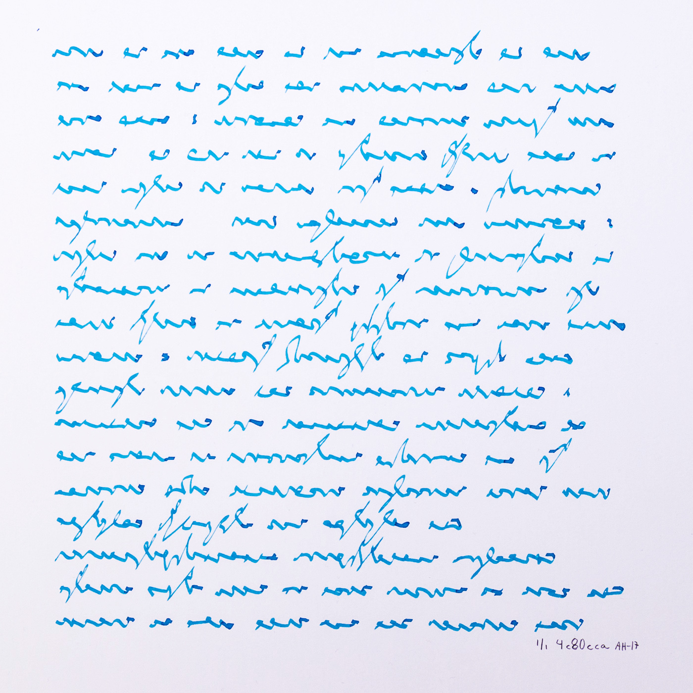
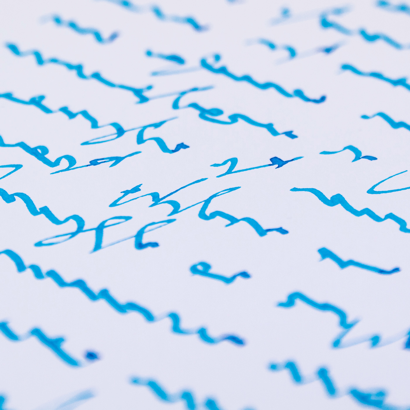
One of the main reasons for coming back to asemic writing is to test it on my plotter. Below is picture of a plot I made with a Pilot Parallel Pen and Lamy turquoise ink. Using a fountain pen gives a very interesting effect as you can see below. The way the ink flows and the resulting gradients and layering effects makes the writing look more convincing.

excerpt from Orxy and Crake by Margaret Atwood.


